Shiny applications are commonly used as a data dashboard, to automate a (data science) workflow, or to easily build a minimum viable product. Shiny is a great tool if you are working with R (and now also with Python)!
This is how RStudio (Posit) explains it:
Shiny is an R package that makes it easy to build interactive web apps straight from R. You can host standalone apps on a webpage or embed them in R Markdown documents or build dashboards. You can also extend your Shiny apps with CSS themes, htmlwidgets, and JavaScript actions.
https://shiny.rstudio.com/
Based on the shiny tutorials on PMXSolutions.com and the number of example applications hosted here, it should not come as a surprise that I am a big fan. However, we recently faced a scientific question at the Centre for Human Drug Research for which I required to use Shiny in a interesting way in order to simulate, present and collect user input to be used in our research.
This post contains some background information on the application I developed for the following open access article: Dose escalations in phase I studies: Feasibility of interpreting blinded pharmacodynamic data
FYI: I have further adapted the application and hosted a version for you to check it out (see below for the link).
The question
In clinical trials, interim results come in during the trial and are presented in a blinded interim report. The ‘blinded‘ means that we are unaware of whether individuals are receiving active treatment or a placebo and figures in the report are being presented as an overall mean for each cohort (calculating the mean over time for the data from both active and placebo subjects together), or, if it is possible, as individual lines.
Even though the discussion of these blinded interim reports are primarily for safety purposes, people are often already looking if they can spot if a drug effect is present on their primary endpoint for a number of reasons. However, randomness in the observations between measurements, variability in drug effect, and changes in baseline response can make it more difficult/impossible to observe these effects during these blinded interim analysis and perhaps we should avoid giving any weight to seeing potential effects at this stage.
Therefore, we wanted “to describe the probability that effects are observed in blinded evaluations of data in a simulated phase I study design.”
However, we did not have any data… yet.
The application
Requirements
- Based on the heatmap we wanted to create, I needed more than 2500 scenario’s to be simulated and analysed to get sufficient resolutions in each of the cells
- This required an easy-to-use and fast user interface
- Accessible via the browser without the requirement of any locally installed programs
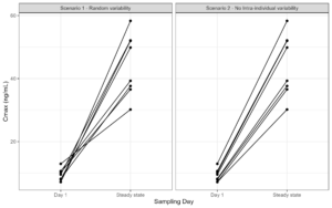
- Every scenario should be based on a unique simulation, from which the individual response was based on a predifined inter-individual variability and a between-measurement variaility, unique for one of 6 pharmacodynamic endpoints that we wanted to study
- Two of my co-authors were also exploring if unblinded interim results provided any better probabilities. This should also be shown in the same application
- The simulation frequency of no effect profiles should be higher as relatively more drug effect scenario’s were present
- The time that people took before providing an answer should be logged
- A username should be provided
- The results should be available for all individual responses to allow for more in depth analysis of the data
- Multiple users should be able to work on it at the same time
Even though Shiny is my go to application software for which I have a bunch of template code already available, I first had to think if any easier alternative was suitable that would match these requirements. After all, I could already simulate all the profiles and store them as png’s and show them to people without any application. However, the scalability would of course be terrible. Also, sending a Word document with all the figures and a table to fill in would make it difficult as I had to manually extract the results and I would be unable to monitor the time it took. Furthermore, setting up some Google form, try to code it in a custom webpage with JS, or some other software package would work but would have costed me more time and frustration then coding it in Shiny.
The minimum viable product (MVP) of the Shiny application
First of all, the hosting of the application was easy, I have a simple internal linux RStudio server at the company for which I have root access (yes that is still possible nowadays once you win the trust of the IT department) on which I installed the open source Shiny server. As this runs internally, all my colleagues could automatically access the applications once logged in on their work environment and visit the app via their browser.
The first iteration of the app was an application to explore a number of different settings in the underlying simulations and see what would happen:

Then, the app was updated with an user interface that was as empty as possible, with an input field to fill in the username and the number of years of experience (which was an exploratory objective), the created figures and just three buttons.
On the background, the details of each simulated scenario (simulated parameter, simulated effect size, and clock time) were saved and the response based on the button click was appended to a simple text file on the server. No complicated database, data lake, or data warehouse, just a plain old text file to which the results get added after a response has been given.
 file_result <- '/srv/shiny-server/CHDR/Interim_Simulations_V2/result.txt'
    if(!file.exists(file_result)){
      write.table(save_df,file_result,sep=",",row.names=F, append=F,col.names = T)
    }else{
      write.table(save_df,file_result,sep=",",row.names=F, append=TRUE,col.names = F)
    }

After this initial version, I performed some trial runs and I asked my co-authors for feedback. Afterwards I implemented some cosmetic changes with a loading spinner to indicate that a new profile was loading, a counter to indicate how many plots someone has already seen, and some updated ggplot settings to make the figures themselves better to read.
The results file could also be downloaded right from the user interface if one of my co-authors were interested to perform an interim analysis on the data and I did not have time to download it from the server via ftp for them...
Final version
After implementing the updates, we invited our colleagues via e-mail to give it a try and aim to look at 100 profiles each. Within days we managed to (crowd)source over 4500 results with the help of 34 of our colleagues who clicked through a median of 100 plots each to be used for further analysis.

And even though this app could be improved in a number of different ways and there are still some visual improvements that could be made, the total time it took to create the whole app was less than 2 days and allowed us to study the questions that we had based on actual quantitative data that we did not have a week earlier.
Try it yourself:
Interested in how the app looks? Give it a try! Are you overly optimistic/pessimistic and seeing drug effects where none are present or are you more conservative in interpreting the data?
I have adapted the app so that you will see your individual results after you have clicked through 50 profiles and compare your performance with the reference population!
Don't worry, I am not saving your individual results.

Added code with user feedback:
In this online version, a counter (as a reactiveValue) and an infoBox was added. Then, when the counter reached 51, a modeldialog was shown in which a plotOutput was present that shows the barplot and the scatterplot showing how the individual response compares to the reference population.
The added BoxOutput:
UI code: valueBoxOutput("progressBox",width=12)
Server code:
  output$progressBox <- renderValueBox({
    valueBox(
      paste("Plots to go:"),  (50-counter$countervalue+1), icon = icon("list"),
      color = "blue"
    )
  })
Server code:
   ## Finish!
    if(counter$countervalue == 51){
      remove_modal_spinner()
      showModal(query_modal)

      sum_stats <- sumstat(output_plot$data)

      ########## Render summary text results
      ncor_no <- sum_stats %>% filter(abs_slope==0 & group=="Individual performance") %>% pull(n_correct)
      if(ncor_no >= 85){
        caption_text_no_effect <- paste("No effect: Well done! You correctly spotted no effects in the data in", ncor_no,"% of the scenarios")
      }else{
        caption_text_no_effect <- paste("No effect: Oops, you observe effects even when none are present! That is not a good sign! You were only correct in", ncor_no,"% of scenarios")
      }

      ncor_yes <- round(mean(sum_stats %>% filter(abs_slope>0 & group=="Individual performance") %>% pull(n_correct)),0)
      if(ncor_yes >= 49){
        caption_text_effect <- paste("Effect: Well done! On average, you correctly spotted effects in the data in", ncor_yes,"% of the scenarios")
      }else{
        caption_text_effect <- paste("Effect: You are struggling to identify effects, even when effects are present, with an average % correct of", ncor_yes,"% ")
      }

output$text_modal_dataset <- renderUI(HTML(paste("- ",caption_text_no_effect,"
- ",caption_text_effect,"
Model dialog info:
###################################################
query_modal <- modalDialog(
  size = "l",

  title = "Results:",

  ## Red or green text with status update
  uiOutput("text_modal_dataset"),
  hr(),
  # Plot with results
  plotOutput('graph_results',height = '400px',width='800px'),

  easyClose = F,
  footer = NULL

)
Interested in reading the open access publication? Click on the abstract below

Thanks to everyone at the Centre for Human Drug Research for participating in this 'trial'.
COMMENT
Any suggestions or typo’s? Leave a comment or contact me at info@pmxsolutions.com!