Model evaluation is a critical step in model development. A very good paper on how to evaluate continuous data pharmacometric models was published by Nguyen et al. in 2017, this paper is a must-read for anyone working or starting to work with non-linear mixed effects modelling (http://onlinelibrary.wiley.com/doi/10.1002/psp4.12161/full).
However, there are limited resources that show an easy step-by-step approach to the R code needed to generate the basic goodness of fit (GOF) figures in R.
As a simple tool in pharmacometrics, the xpose package was developed which implements many interesting functions to be used with your NONMEM output (https://uupharmacometrics.github.io/xpose/index.html). This has recently been updated and discussed on the ISoP forums with a webinar on youtube (http://discuss.go-isop.org/t/introduction-to-the-new-xpose-r-package/1097 https://www.youtube.com/watch?v=mqRDFgYDywg).
However, sometimes you just want to tweak some small items in your GOF figures and you need to create your own GOF script. Therefore, I will discuss in detail the R code, without the use of the plotting functions of xpose, used to create the following figures using the ggplot2 package:
- Population model predictions versus observations
- Individual model predictions versus observations
- Conditional weighted residuals versus population predictions
- Conditional weighted residuals versus time
- Individual + population model prediction and observations over time per individual
Interesting background references to get started with R and ggplot2:
ggplot2 tutorial
Datacamp introduction to R
Datacamp tutorial on ggplot2
First things first, in order to plot the output of your model, we need some output in our $TABLE section of our NONMEM model code.
Most commonly, an SDTAB is created as an output table which should contain the individual prediction IPRED or IPRE (F in NONMEM), the population prediction PRED, CWRESI, the subject identifier ID, TIME, and the observations (DV). All used model files and datasets are included as attachments to this blog.
The output SDTAB dataset can be read using the read_nm_tables() function from the xpose package and gives us a good starting point. The dataframe that includes the data for plotting is called df.
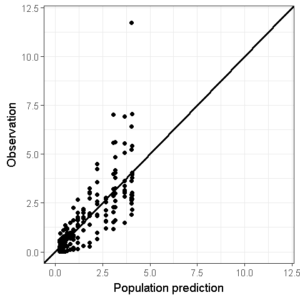
Population/individual model predictions versus observations
The first two GOF figures we will look at are quite similar, they both contain a line of unity (straight line with a slope of 1 between x and y), the observations, and the model predictions.
Lets start with the population predictions, we want to create a ggplot object that contains all the information listed above.
ggplot(data=df,aes(x=PRED,y=DV))+
geom_point()+ ## Add points
geom_abline(intercept = 0, slope = 1,size=1)+ # Add Line of unity
theme_bw() + # Set theme
xlab("Population prediction") + ylab("Observation") # Set axis labels
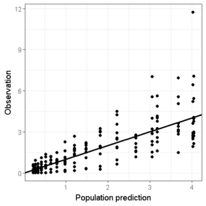
I personally feel that it looks best when the line of unity has an intercept of 0, which means that the x- and y-axis limits should be identical.
By creating 2 new objects, conc_min and conc_max we are able to set the same limits between all the GOF figures:
conc_min <- 0.01
conc_max <- 12

ggplot(data=df,aes(x=PRED,y=DV))+
geom_point()+ ## Add points
geom_abline(intercept = 0, slope = 1,size=1)+ # Add line of unity
theme_bw() + # Set theme
scale_x_continuous(limits=c(conc_min,conc_max)) +
scale_y_continuous(limits=c(conc_min,conc_max)) +
xlab("Population prediction") + ylab("Observation") # Set axis labels
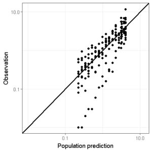
We can also change this plot to a logarithmic scale to also judge the model performance in the lower concentration regions (remember that the minimum limit of the axis cannot be 0 on a logarithmic axis which will trow an error message):
conc_min <- 0.01
conc_max <- 12

ggplot(data=df,aes(x=PRED,y=DV))+
geom_point()+ ## Add points
geom_abline(intercept = 0, slope = 1,size=1)+ # Add line of unity
theme_bw() + # Set theme
scale_x_log10(limits=c(conc_min,conc_max)) + # Set logarithmic scale
scale_y_log10(limits=c(conc_min,conc_max)) +
xlab("Population prediction") + ylab("Observation") # Set axis labels
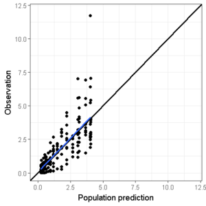
We can also add a smoother function to see whether a certain trend is visible. However, I personally don’t often use this since the use of the ‘span’ argument in this function can really bias the interpretation.
ggplot(data=df,aes(x=PRED,y=DV))+
geom_point()+ ## Add points
geom_abline(intercept = 0, slope = 1,size=1)+ # Add line of unity
theme_bw() + # Set theme
scale_x_continuous(limits=c(conc_min,conc_max)) +
scale_y_continuous(limits=c(conc_min,conc_max)) +
xlab("Population prediction") + ylab("Observation") + # Set axis labels
geom_smooth(se=F,span=1)
Now, we can copy the same object and replace the PRED with IPRED and the y-axis labels and the first 2 GOF figures are done:
ggplot(data=df,aes(x=IPRE,y=DV))+ # Depict individual prediction
geom_point()+ ## Add points
geom_abline(intercept = 0, slope = 1,size=1)+ # Add line of unity
theme_bw() + # Set theme
scale_x_continuous(limits=c(conc_min,conc_max)) +
scale_y_continuous(limits=c(conc_min,conc_max)) +
xlab("Individual prediction") + ylab("Observation") # Set axis labels

Conditional weighted residuals versus population predictions or time
The next two figures are also not that far apart.
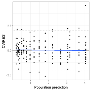
We want to plot the conditional weighted residual at each observation versus the population prediction and versus time. These GOF’s are usefull in spotting model misspecification and immediately seeing where in your concentration-time profile this occurs (through concentrations, peak concentrations, absorption phase, etc).
We also want to judge whether the distribution of the CWRESI is homogenous and the majority lies within the [-2,2] acceptance interval.
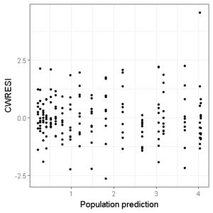
Lets create a new plot with all the points in the figure:
ggplot(df,aes(x=PRED,y=CWRESI))+
geom_point(size=1)+
scale_x_continuous()+
scale_y_continuous()+
theme_bw()+
ylab("CWRESI")+ xlab("Population prediction")
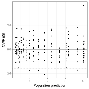
Then, we add three horizontal dashed lines to indicate the acceptance interval:
ggplot(df,aes(x=PRED,y=CWRESI))+
geom_point(size=1)+
scale_x_continuous()+
scale_y_continuous()+
theme_bw()+
ylab("CWRESI")+ xlab("Population prediction")+
geom_hline(yintercept = 0) +
geom_hline(yintercept = -2, color='grey', linetype='dashed')+
geom_hline(yintercept = 2, color='grey', linetype='dashed')
And we can even add a smoother if we want:
ggplot(df,aes(x=PRED,y=CWRESI))+
geom_point(size=1)+
scale_x_continuous()+
scale_y_continuous()+
theme_bw()+
ylab("CWRESI")+ xlab("Population prediction")+
geom_hline(yintercept = 0) +
geom_hline(yintercept = -2, color='grey', linetype='dashed')+
geom_hline(yintercept = 2, color='grey', linetype='dashed') +
geom_smooth(se=F,span=1)
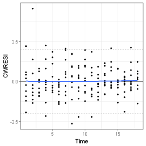
If we replace the PRED with TIME and change the x-axis labels, the third and fourth GOF figures are done!
ggplot(df,aes(x=TIME,y=CWRESI))+
geom_point(size=1)+
scale_x_continuous()+
scale_y_continuous()+
theme_bw()+
ylab("CWRESI")+ xlab("Time")+
geom_hline(yintercept = 0) +
geom_hline(yintercept = -2, color='grey', linetype='dashed')+
geom_hline(yintercept = 2, color='grey', linetype='dashed') +
geom_smooth(se=F,span=1)
We can save these in 1 image (.png, .tiff, .jpeg, you name it) or as a first page of a pdf file by combining them using the cowplot package in R.
library(cowplot)
plot_grid(img1,img2,img3,img4,ncol=2)
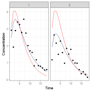
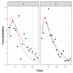
Individual + population model prediction and observations over time per individual
We want to see if the model fits the individual observations accurately.
If we would only have 1 individual, we would do something like this:
## Individual graph
data_plot <- df[df$ID ==1,] # Select data from ID 1
ggplot(data = data_plot, aes(x = TIME, y = IPRE)) +
geom_line(color = '#001158') + # Individual predictions
geom_line(data = data_plot, aes(x = TIME, y = PRED),color = 'red') + # Population predictions
geom_point(data = data_plot, aes(x = TIME, y = DV),color = 'black') + # Observations
theme_bw()+
ylab("Concentration")+
xlab("Time")
Which shows the observations (circles), the population model prediction (red line) and the individual model prediction (blue line).
You can change the scale, linear or log, and colors to your own liking of course.
However, when we have 10 individuals side by side, it becomes chaotic and we need to do something different. The original lattice package in R has the ‘layout’ argument which is lacking in ggplot… So we need to code something ourselves.
First, we want to specify how many subjects per page we would like to show, then we select that number of subjects multiple times from our original dataset and create an image, we then repeat these steps until we have seperate graphs of all individuals.
## Set the number of individuals per page
NumberOfPlotsPerPage <- 2


## Individual fit

for(i in 1:ceiling((length(unique(df$ID)))/NumberOfPlotsPerPage)){ ## Start loop here

subjects <- unique(df$ID)[(i*NumberOfPlotsPerPage-(NumberOfPlotsPerPage-1)):(i*NumberOfPlotsPerPage)]
subjects <- subjects[!is.na(subjects)] # Create a vector with new ID numbers

## Select a new batch of individuals
DataPlot <- df[df$ID %in% subjects,]


# Create concentration-time profile
p<- ggplot(data = DataPlot, aes(x = TIME, y = IPRE)) +
geom_line(color = '#001158') +
geom_line(data = DataPlot, aes(x = TIME, y = PRED),color = 'red') + ## Population prediction = red
geom_point(data = DataPlot, aes(x = TIME, y = DV),color = 'black') + ## Individual prediction = blue
facet_wrap(~ID)+
theme_bw()+
ylab("Concentration")+
xlab("Time")


## Save as png
ggsave(paste('GOF_',i,'.png',sep=""),plot=p,height=480,width=480,units='px')

}
We can again save the individual plots as seperate images or combine them in a single pdf.
Additional remarks
In order to make this script as user friendly as possible, try not to fix the scales of the x- and y-axis but let them be estimated on the basis of the observations. The next piece of code will add 10% on the bottom and top of the maximum observations to make sure we capture all observations in the GOF figures.
axis_min <- min(SDTAB$DV) - min(SDTAB$DV)*0.1
axis_max <- max(SDTAB$DV) + max(SDTAB$DV)*0.1
Then, the only thing we need to change when we want to create the GOF figures of a new model is the table input name. Therefore, the use of an object called model_name is recommended, which is the only part of your new R script to be changed everytime you want to create your model diagnostics.
In the final script below you can also see that I use the model_name object in the generation of file names which creates a nice generalized output per model.
Combining all these codes will result in a very dynamic, user friendly GOF R-script that can be universally used in the evaluation of NONMEM models.
Final R-script for NONMEM goodness of fit figures
##################################################################################
############################ CODING BLOCK ########################################
##################################################################################
# Run-Time Environment: R version 3.4.0
# Short title: NONMEM goodness of fit in R with ggplot2 package
#
# Datafiles used: Model output SDTAB
#
##################################################################################
##################################################################################
## Clean environment of previous objects in workspace
rm(list = ls(all.names= TRUE))
###

# Set version number of this script
version <- 1.0

## Load libraries used in this script
library(ggplot2) # For plotting
library(xpose) # For read in NM output
library(cowplot) # For plotting multiple graphs

## Set variables needed in the script

# Set working directory where the NM output is located
setwd("")

# Set model name
model_name <- 'Model001'

## Concentration axis label
conc_axis_label <- "Concentration (ng/mL)"

## Time axis label
time_axis_label <- "Time (h)"

# How many plots per page with individual profiles?
NumberOfPlotsPerPage <-2

################
# Read dataset
# --------------

## Read in the output dataframe.
# The file SDTABModel001 will be read

df<-read_nm_tables(paste('SDTAB',model_name,sep=""))

### If the header contains MDV, remove all MDV ==1
if("MDV" %in% colnames(df))
{
df<-df[df$MDV!=1,]
}

## Remove where DV = 0 if needed
df<-df[df$DV!=0,]

## Sometimes IPRED is used instead of IPRE, change this for consistency if needed
if("IPRED" %in% colnames(df))
{
names(df)[names(df) == 'IPRED'] <- 'IPRE'
}

## Set axis min and max, and check whether DV or IPRE is lowest/highest for plotting purposes
axis_min <- ifelse(min(df$DV) < min(df$IPRE), min(df$DV)- min(df$DV)*0.1,min(df$IPRE)- min(df$IPRE)*0.1)
axis_max <- ifelse(max(df$DV) > max(df$IPRE), max(df$DV)+ max(df$DV)*0.1,max(df$IPRE)+ max(df$IPRE)*0.1)

### Start creation of a pdf file here with an informative title
pdf(paste("GOF",model_name,Sys.Date(),version,"pdf",sep="."))

#########################################
## Create one page with the 4 GOF figures

DVPRED <- ggplot(data=df,aes(x=PRED,y=DV))+
geom_point()+
geom_abline(intercept = 0, slope = 1,size=1)+
scale_x_log10(limits = c(axis_min, axis_max), expand = c(0, 0)) +
scale_y_log10(limits = c(axis_min, axis_max), expand = c(0, 0)) +
labs(x="Population predictions",y="Observations") +
theme_bw()

DVIPRE <- ggplot(data=df,aes(x=IPRE,y=DV))+
geom_point()+
geom_abline(intercept = 0, slope = 1,size=1)+
scale_x_log10(limits = c(axis_min, axis_max), expand = c(0, 0)) +
scale_y_log10(limits = c(axis_min, axis_max), expand = c(0, 0)) +
labs(x="Individual predictions",y="Observations") +
theme_bw()

CWRESTIME <- ggplot(df,aes(x=TIME,y=CWRESI))+
geom_point(size=1)+
scale_x_continuous()+
scale_y_continuous(breaks=c(-4,-2,0,2,4))+
theme_bw()+
ylab("CWRESI")+
xlab(time_axis_label)+
geom_hline(yintercept = 0) +
geom_hline(yintercept = -2, color='grey', linetype='dashed')+
geom_hline(yintercept = 2, color='grey', linetype='dashed')

CWRESPRED <- ggplot(df,aes(x=PRED,y=CWRESI))+
geom_point(size=1)+
scale_x_continuous()+
scale_y_continuous(breaks=c(-4,-2,0,2,4))+
theme_bw()+
ylab("CWRESI")+
xlab("Population predictions")+
geom_hline(yintercept = 0) +
geom_hline(yintercept = -2, color='grey', linetype='dashed')+
geom_hline(yintercept = 2, color='grey', linetype='dashed')

## Combine plots on one page

plot_grid(DVPRED,DVIPRE,CWRESPRED,CWRESTIME,ncol=2)

## Individual profiles with model fit

for(i in 1:ceiling((length(unique(df$ID)))/NumberOfPlotsPerPage)){

subjects <- unique(df$ID)[(i*NumberOfPlotsPerPage-(NumberOfPlotsPerPage-1)):(i*NumberOfPlotsPerPage)]
subjects <- subjects[!is.na(subjects)]

## Select a new batch of individuals
DataPlot <- df[df$ID %in% subjects,]

# Create Individual plot on linear scale
p_lin<- ggplot(data = DataPlot, aes(x = TIME, y = IPRE)) +
geom_line(color = '#001158') +
geom_line(data = DataPlot, aes(x = TIME, y = PRED),color = 'red') +
geom_point(data = DataPlot, aes(x = TIME, y = DV),color = 'black') +
facet_wrap(~ID)+
theme_bw()+
ylab(conc_axis_label)+
xlab(time_axis_label)

print(p_lin)

# Create Individual plot on log scale
p_log<- ggplot(data = DataPlot, aes(x = TIME, y = IPRE)) +
geom_line(color = '#001158') +
geom_line(data = DataPlot, aes(x = TIME, y = PRED),color = 'red') +
geom_point(data = DataPlot, aes(x = TIME, y = DV),color = 'black') +
scale_y_log10()+
facet_wrap(~ID)+
theme_bw()+
ylab(conc_axis_label)+
xlab(time_axis_label)

print(p_log)

}

dev.off()

### End of Script ###
#####################
Make sure that all downloaded files have the right extensions:
Model001
Estimation dataset
SDTABModel001
Comment
Any suggestions or typo’s? Leave a comment or contact me at info@pmxsolutions.com!